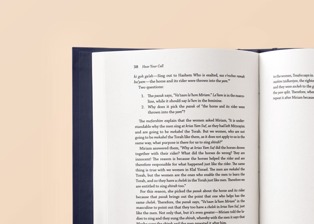
What You Must Know About Fonts When Publishing
As an author, while the content of your book is crucial for securing your readers’ attention, typography also plays an essential role. It enhances their experience by arranging each letter and word in a manner that improves readability and the reader’s perception of your book.
Typography conveys the information in your book more effectively, evokes the right tone, and improves the overall aesthetic of your book. When publishing, your book’s interior layout and design are crucial. This vital process enhances the quality of your book.
Unless you are a typographer, it might be daunting and time-consuming to select the right fonts and design for your book. Therefore, hiring a professional is your sure bet.
Before we delve into the role of fonts in publishing, let’s examine some factors to consider when choosing a font. Some of the factors are:
- Readability: Your choice of font must be readable. Legible fonts improve readability, provide a smooth reading experience, and eliminate discomfort and distraction for your readers.
- Subject Topic: Your font should align with the subject or genre of your book. It must also align with the tone of your book’s content and style.
- Audience: Your choice of font must resonate with your audience. In choosing a font for your book, you must consider your audience’s age group and preference for industry-related topics.
- Aesthetics: A visually appealing font is great for captivating and retaining your reader’s attention. It sets the mood, projects the quality of your work, and contributes to the overall reader’s experience.
Now, let’s examine the role of fonts in publishing.
- Improves Readability
While all fonts are technically readable, not all offer the same readability.
You certainly couldn’t pick the words in the above sentence easily, right? In publishing, there are no good or bad fonts. While all fonts are technically readable, some provide a smoother reading experience than others. You must know which fonts are appropriate or inappropriate for your publication. Furthermore, your choice of font, font size, line spacing, and margins are vital in keeping your audience engaged and providing a great reading experience.
- Showcases Professionalism
Your choice of font shapes your professional image. Many fonts are available for use but a wrong choice can communicate the wrong message to your readers. For example, Comic Sans MS is perfectly suited for children’s books, comics, and cartoons. It should not be used in professional or business writing; it can deter your readers.
- Creates Brand Identity
Consistent typography creates an easily recognisable brand identity and strengthens your audience’s connection with your brand. Furthermore, it establishes your author’s persona and captures your reader’s curiosity.
In conclusion, while the content of your book is fundamental to capturing your readers’ attention; choosing the right fonts in the publishing process for your book improves branding, demonstrates professionalism, and enhances your reader’s experience.
At BookSpider, we provide excellent publishing services that include tailor-made fonts for your book. To get started, send us an email today.


